Every Logo has a Story, and Ours is as Enthralling as Our Business Journey!

“It was a spring afternoon when I was at my workspace with a cup of coffee, and this thing came to my mind.
As our partners go a mile extra to make people connect and share their boundless love for their families.
Our logo should also be boundless with colors of the rainbow in it and sailing beyond the horizons.“
Mr. Bankim Brahmbhatt,President and CEO – Bankai
In every company’s life, there comes a moment when you need to look closer at who you are, how you’ve become this, and make that visible to others. And that eureka moment is here for Bankai as we have developed a new logo that will transform our brand identity.
Over the past three decades, Bankai has been the change maker and dominant industry leader in the telco and voice businesses. We have been the key differentiator in taking the traditional voice business to the new age of modern telecom. As a group, we believe in doing ‘Business with Ethics.’ We are a visionary organization, and while businesses think of either ‘next quarter or year,’ Bankai thinks and works for the next generation.
![]()
Our work process is a testimony to how a thriving ‘culture of collaboration’ works and takes the business organization to higher levels. Therefore, everyone associated with the ecosystem elevates the organization’s growth.
In the three-decade-long journey, we have encouraged the inclusion of people from different diversities and work experiences.
At Bankai, we appreciate newer perspectives, unique work approaches, and out-of-the-box ideas for the greater good of our clients, end consumers, and stakeholders. This not only helps us to understand the ever-evolving market trends but also allows us to be innovative in our work methods and tactically overcome business challenges.
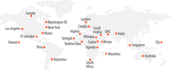
Though our roots belong in India, we have a wide presence in the world’s major continents, including Asia, Africa, Europe, North and South America, and Australia.
How’s our New Logo
Our logo is all-encompassing and multi-dimensional, with the essence and colors representing our values.
Bankai’s new logo has bright colors that show our drive for excellence in everything we provide to the end consumers. Our logo signifies our diversified workforce as well. It symbolizes a dynamic and uniform business identity for all the Bankai businesses and brands.
The new Bankai logo is the epitome of our evolution and signifies our vision. It offers Bankai a refreshed brand identity and withholds our ongoing business reputation intact. It has the essence that represents our purpose and goals.
The multi-colored globe in the logo indicates the global footprints of the Bankai. These colors also resemble the Tri-colored Indian flag, as they depict the Indian roots of our ubiquitous organization and how we sync with our culture, values, mission, and vision as a group.
What do the Colors in our new Logo signify?
TThe updated Bankai Logo represents the global expansion and progress of the group with its five striking colors and four colorful skyward stripes.
Our new logo is the essential element of our brand identity. It speaks to consumers, investors, and fellow company employees in a way that other marketing elements can’t; it helps communicate who we are as an organization and what value we provide.
![]()
Jaffa Orange for Community: The iconic Jaffa Orange color symbolizes the ascent of Bankai as a blazing Sun and the vibrant culture of India.
“Enrich & Expand your community” with this idea; we created this logo to tap into the global market with a corporate visual identity. This includes unlocking opportunities – amplifying innovations by creating initiatives and collaborating with the network that provides new perspectives, diverse experiences as well as multidisciplinary expertise.
Branding enables our community to focus on attracting, engaging, and retaining in the market, which emphasizes creating a consistent, positive, trust, sustainable development, and differentiated value proposition to increase among the community. This creates a fit between the company’s values, culture, vision, mission, expectations, and goals that drive it to elevate the telecom sector.
Fiord Blue for Partners: The Fiord Blue color represents the excellence and solidarity of our organization and the reliability of our offerings.
Our brand is the heart of our mission and passion. Partners have been an integral part of our mission, and they continue to be an essential component of our success. Our goal with the new logo is to create a unified brand for partners to reinforce the expertise and trust that defines our relationship with the customers. It can further demonstrate their deep technical knowledge and experience by earning a specialization related to a specific technological scenario -a powerful tool for boosting brand awareness and discovering valuable distribution channels.
Yellow for Employees: Yellow signifies the brightness, friendliness, cheerfulness, and youthful energy of our workforce. It also symbolizes our team’s brave ambitions to achieve more than we ever thought possible.
Creating a strong and differentiated brand ensures an increased sense of belongingness and alignment of goals for employees. Branding strategies not only help in the management of human capital but also help in the attraction and engagement of the right people. Value congruence ensures that employees believe that they are valued and may go the “extra mile” to achieve the organizational objectives. Bankai motivates its employees to have a reason to share their experiences.
Green for Customers: The green color in our new logo represents the prosperity, growth, and unparalleled success of our organization. It also shows our solidarity in work ethics.
Our new logo will create a stronger sense of loyalty among consumers who appreciate the value. Differentiate brands from competitors, facilitate brand recognition, influence customers’ decisions, and convey what a brand stands for. The logo is created to communicate our core values to consumers visually, interestingly, and as a concrete, marketable brand identity.
Blue for Investors: The color blue symbolizes our fresh outlook on everything we do. In addition to indicating the group’s inspired work style, the blue color indicates its stability.
Our new logo has a powerful message for our investors depicting the recognition and trust we have earned globally. At Bankai, we understand the needs of our investors in determining the benefits they’re seeking and their priorities. Our logo signifies that building value and gaining the trust of investors is imperative for an organization. This is where a positive corporate image and consistent brand equity come into play.
To conclude, Bankai is scripting its growth story, and the new group logo is an essential milestone in our spectacular journey. It’s the epitome of Bankai’s growth with new horizons to conquer and become a world-class enterprise.